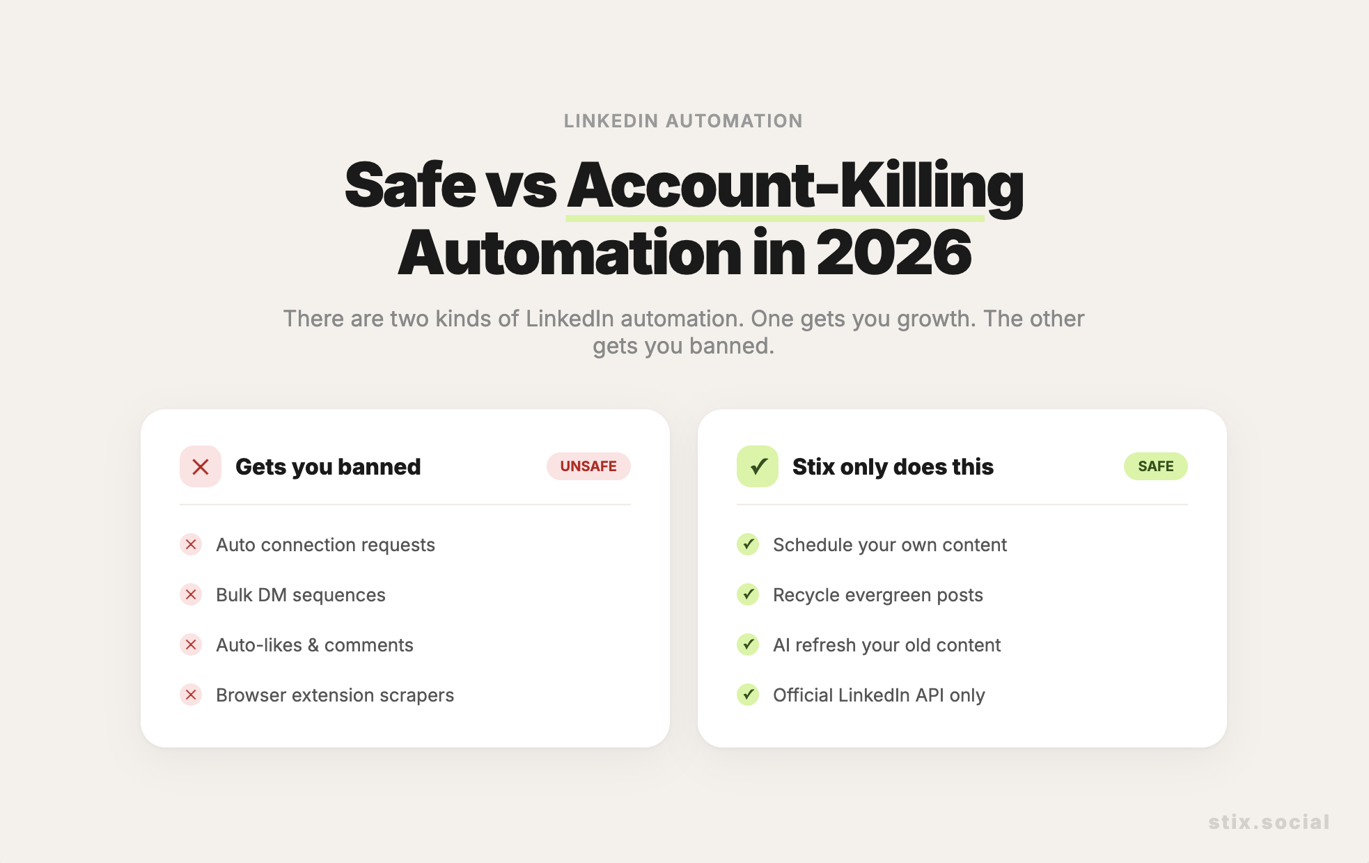
We have all done it. You have a complex thought, so you write a complex paragraph. It looks fine on your laptop screen. But then you post it, and on a phone screen, it looks like a solid wall of grey text.
This is a Cognitive Load problem.
When a reader sees a dense block of text, their brain estimates the energy required to process it. If the estimate is "High Effort," the brain sends a signal to scroll past. We want to signal "Low Effort, High Reward."
You don't have to dumb down your ideas. You just have to format them for the human eye. We call this "Breathing Room."
The 'Wall of Text Destroyer' prompt
You don't need to manually hit 'Enter' a hundred times. Let AI refactor your formatting.
The Prompt:
"Refactor the text below for mobile readability on LinkedIn.
Formatting Rules:
- No paragraph should be longer than 2 sentences.
- Use '—' and line breaks to create rhythm.
- Use bullet points for any lists.
- Bold key phrases to guide the skimming eye.
- Do not change the meaning, just the structure.
Text: [Paste Draft]"
Why this matters
This style of writing is often mocked as "LinkedIn Broetry" (those one-line paragraphs). You don't have to go that extreme. But you must respect the medium.
Stix automatically previews your posts in "Mobile View" before you publish, so you never accidentally post a wall of text. But until you use Stix, use this prompt to keep your readers' eyes happy.